My portfolio website: cecilypincsak.com
Link to my emailable portfolio: https://www.dropbox.com/s/9e56q4x0ami5est/pincsak%20pdf%20portfolio.pdf
Out of the three projects in Practicum this semester, I think the creation of my portfolio was what stressed me out the most. At first, I had the rather lofty goal (for me, anyway) to design and code my website entirely from scratch. I was actually into the coding process about halfway through the semester when it became apparent that it was simply too overwhelming and time-consuming an endeavor for someone of limited web experience/confidence. Meanz told me about the hosting site she was using for her portfolio site, Cargo Collective, so I looked into that as an option... and very quickly became a convert, changed my plans, and signed up for my own! Cargo provides a number of basic templates for you to choose from and makes the uploading process incredibly easy, but they also allow you to go into your site's CSS and customize it any way you would like, which is really the perfect balance for me. I have a few minor things to add (I would like to retake some photos over the summer and I need to compose a more engaging "About me" page), but my portfolio site is essentially complete and it has been fully functional from the moment I set it up. I will definitely be staying on Cargo for the foreseeable future.
I had very lofty goals for my presentation portfolio, as well... after seeing what Isaac put together, who wouldn't? Time and indecision got the best of me this semester, though, and I ended up decided to get a presentation case from Pina Zangaro rather than make my own--and I love it. I got a clean, minimal, white acrylic book that I will be able to happily use for years, and which allows the work it showcases to (rightfully) take the spotlight. I used my leave-behind as a chance to create a mini handmade portfolio, instead.
The important part of all this is, of course, the work I am choosing to show. All of the pieces I picked for my presentation and emailable portfolios are ones that I take pride in, and which I feel helped me to grow as a designer. I included a few more minor pieces on my website, but there is nothing present that I am not proud of and glad to showcase as my own. I think I created a good arc in my presentation to maintain the viewer's interest and to show a variety of projects, beginning and ending with my strongest pieces. Once I have a job and am creating regular work, I am sure that some of my school projects will disappear from the portfolio more quickly than others... but I like to think that I will still be very proud of my Dadaist Manifesto, Knowledge Map, and Murphy's Law book many years from now! As with everything this semester, this was an incredibly useful and necessary project for me and I'm glad the Practicum course gave me the opportunity to spend time developing it.

Wednesday, May 15, 2013
PROJECT 2 ASSESSMENT
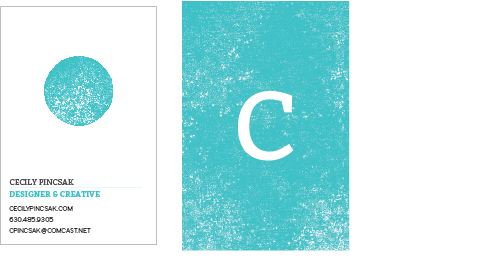
I dedicated an earlier post entirely to images of my finished stationary system, so feel free to bounce back and forth while reading. I knew what direction I wanted to take for this project pretty early on in the semester: my blog post immediately before Spring Break documented my system's early incarnation, for reference. It has undergone some revisions since then, but no major changes in direction or complete re-dos (other than the necessary re-creation of everything after the loss of my data a few weeks ago). Even though this is a stationary system I will use when seeking a design job, I wanted to give a nod to another interest that is dear to my heart and highly influential over my design work: printmaking! I cut the components for the original logo out of MDF board and printed them multiple times on newsprint to give myself varying textures to work with. After scanning them in, I was able to play with the pieces and their colors and build my system from there. The original stationary ended up feeling a little heavy and over-worked (especially with the pervasive line pattern I was using on everything), and my teal color was printing darker and duller than I wanted (although it was wonderfully bright onscreen!), so I made a few tweaks until I had the current feel, color, and layout, but with the older style logo. Again, I thought it felt very heavy, so I dropped the black outlines and went with the much lighter, fresher-feeling blue dot and white C.
I'm quite happy with my final identity system, and I think it will remain useful for me for some time. I think it fits my personality well while still appearing professional and clean, and it's flexible enough where I will be comfortable using it to apply to a wide range of jobs. It's entirely bleed-free (unlike the former version) and very easy to maintain with little or no work (since I will not have immediate access to the Adobe Suite after leaving Drake). This was a very productive project for me, and a really great way to watch myself refine a system until I found a satisfying solution I can be proud of
I'm quite happy with my final identity system, and I think it will remain useful for me for some time. I think it fits my personality well while still appearing professional and clean, and it's flexible enough where I will be comfortable using it to apply to a wide range of jobs. It's entirely bleed-free (unlike the former version) and very easy to maintain with little or no work (since I will not have immediate access to the Adobe Suite after leaving Drake). This was a very productive project for me, and a really great way to watch myself refine a system until I found a satisfying solution I can be proud of
PROJECT 3 ASSESSMENT
Final tally of activity points:
200 points: BFA Thesis Exhibition.
+ 15 points: Juried Exhibition Submission
+ 15 points: Reading responses (I did two, but I have extra points anyway!)
+ 25 points: Teaching candidate activities (I attended five)
= 255 out of 250 possible.
Because my BFA show comprised the majority of this project, my longer post on that from a few weeks ago is a pretty good summation of how I used this third credit hour! I am so grateful that we were able to use that experience as a component of Project 3, because the sheer time commitment required felt like adding an entire course to our schedules. As I said in my activity notes for the show, it was one of the most rewarding experiences of my life so far; I grew in so many valuable, tangible ways that it really did fully embody the idea behind Project 3. Working in close collaboration with my group members required careful time management and prompt attention to emails and other communications, because we were determined that no one would be left picking up the slack for anybody else. In addition to working on a team with my own peers, I gained a great deal of experience in working with outside vendors to get the materials and services we needed. In particular, I worked very closely with Christian Printers in person and over the phone to make sure our print materials would turn out perfectly (and got several unofficial tours of their facilities as well, which was an added bonus!). I got experience in budgeting and comparing prices from various vendors, and started to get a feel for how slowly or quickly we could expect certain jobs to get done for us. And, of course, I learned more about curating a show, prepping and installing in a gallery, and planning an exhibition opening than I ever thought I would know! All in all, it was an incredible experience that helped me grow a great deal as an artist, designer, and soon-to-be-professional.


PRESENTATION PORTFOLIO


I am using a presentation portfolio and sheet protectors from Pina Zangaro, which allows me a lot of flexibility in customizing the inserts and easily changing things around when I need to. I wanted to keep the portfolio itself very clean and understated, allowing the work I am showcasing to take the spotlight. I feature my work through photographs of the finished objects partly out of personal preference and partly due to necessity, now--after my files were lost to a fried hard drive, I lost any way of re-printing those pieces or even accessing the original digital files. Keeping the originals pristine and showing them through photographs is the solution!
PORTFOLIO REVIEWS


ACTIVITY NOTES ON EXHIBITION SUBMISSION
Type of Activity: Entry to juried exhibition
Points Available: 15
Date: Submitted May 2, 2013
Location: Annmarie Sculpture Garden & Art Center in Maryland
Presenters: The juror is Andrew Wodzianski, Professor of Art, College of Southern Maryland
Title: Humor Me!
Entry: I happened upon this call for entries several weeks ago as my BFA exhibition was wrapping up, and it seemed like a great opportunity to try and show some of my pieces on a national level. Although most of my work this year has included humor to varying extents, I decided to submit my two "hybrid" pieces (i.e. those that combined printmaking and graphic design) because they relate strongly to my own experiences and best reflect my varied interests. The show is all about humor and bringing joy to the viewer, and it is open to all forms of media, from sculpture to print to graphic design work.
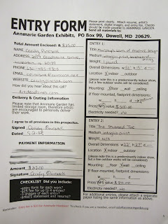
Assessment: My submissions will be assessed by the show juror. Along with the application (photographed below--I was surprised they required a mailed form!), I submitted a CD with photographs of the two pieces for the juror to judge. I will not know if my work has been selected or denied until August 15th, so I have a while to wait on this one!
Conclusion: This was my first entry to a juried show outside of Drake's annual exhibition, and my first submission on a national level. As an appreciator of good humor myself, I think it is a wonderful exhibition theme and a good reminder that we needn't take art and design so seriously all the time! I am confident in the pieces that I submitted and I feel that they have a decent chance of getting into the show. If one or both of them do, I will definitely have to plan a trip out to Maryland to see them at the Annmarie Center.
Documentation:
Points Available: 15
Date: Submitted May 2, 2013
Location: Annmarie Sculpture Garden & Art Center in Maryland
Presenters: The juror is Andrew Wodzianski, Professor of Art, College of Southern Maryland
Title: Humor Me!
Entry: I happened upon this call for entries several weeks ago as my BFA exhibition was wrapping up, and it seemed like a great opportunity to try and show some of my pieces on a national level. Although most of my work this year has included humor to varying extents, I decided to submit my two "hybrid" pieces (i.e. those that combined printmaking and graphic design) because they relate strongly to my own experiences and best reflect my varied interests. The show is all about humor and bringing joy to the viewer, and it is open to all forms of media, from sculpture to print to graphic design work.
Assessment: My submissions will be assessed by the show juror. Along with the application (photographed below--I was surprised they required a mailed form!), I submitted a CD with photographs of the two pieces for the juror to judge. I will not know if my work has been selected or denied until August 15th, so I have a while to wait on this one!
Conclusion: This was my first entry to a juried show outside of Drake's annual exhibition, and my first submission on a national level. As an appreciator of good humor myself, I think it is a wonderful exhibition theme and a good reminder that we needn't take art and design so seriously all the time! I am confident in the pieces that I submitted and I feel that they have a decent chance of getting into the show. If one or both of them do, I will definitely have to plan a trip out to Maryland to see them at the Annmarie Center.
Documentation:

Monday, April 15, 2013
ACTIVITY NOTES ON BFA THESIS EXHIBITION
Type of Activity: Senior BFA Thesis Exhibition
Points Available: 200 points
Date: April 12-28, 2013
Location: Anderson Gallery, Fine Arts Center, Drake University
Presenters: Cecily Pincsak, Meanz Chan, Hannah Pink, Aron Johnston
Title: Proximity
Entry: This exhibition is the culmination of months of preparation by my three classmates and I, and a representation of our current work as senior Art & Design students at Drake. While our pieces are all independently created and in line with our individual areas of interest, the show itself was completely collaborative and would not have been a success without everyone's dedication, work ethic, enthusiasm, and good humor. The four of us were responsible for every aspect of planning and executing the exhibition, from contacting local media outlets to purchasing the food for the reception. We developed an identity system for the show (pictured below) and designed a cohesive set of collateral materials including mailers, posters, wall vinyl, t-shirts, and gallery guides. My group worked very hard to curate a balanced, engaging, and diverse exhibition featuring pieces from across the spectrum of Fine Art and Graphic Design. Along with the content, we put a great deal of consideration (and time!) into the show's physical design and installation, and were meticulous in every aspects of our preparations to host a successful opening reception and two-week run.
Assessment: Our exhibition has not been "officially" assessed at present, although we are in the process of scheduling a review discussion between the four of us and A&D faculty members. I will update this entry with information from this review once it has taken place. My group is keeping an eye on the media outlets we sent press releases to as well, to see if any reviews of the show are published in the near future. If we find any, I will update this entry to include those as well.
Conclusion: This was absolutely one of the most challenging, intimidating, and rewarding experiences of my life. Putting together this collaborative show has helped me grow in ways I could never have anticipated--but, fittingly, one of the biggest surprises for me was realizing the enormous role design played in the process. From the beginning, I was openly skeptical that design would come into play very much during what was clearly an art show... I love the idea of hybridizing the two, but I didn't see my design pieces working well with my print pieces in any context (and especially not with the drawing and painting pieces of my group members). I assumed that the BFA exhibition was meant to showcase our normally-secondary studio work--after all, why would we be getting a BFA and a studio minor if there was no chance to celebrate or focus on those pieces as well?
Of course, this was not the case. First off, there were the obvious design projects that needed to happen: I was primarily responsible for designing our show's logo and identity system (with input from my groupmates), and developing both the mailer and the gallery guide took far more thought and work than I'd anticipated. Having never designed a functional postcard before, I was in frequent contact with Drake's post office to make sure that our card's layout met all the postal regulations for mailing; any real-world experience is extremely valuable to me, and I am sure this knowledge will come in handy in the future. I worked closely with Christian Printers to produce our mailers and gallery guides, and I felt like I developed a good relationship with them as a client during the several weeks I was in contact with them. We students hear how important it is to build lasting relationships with printers and other service vendors, and I think a project like this was the perfect way to start that process.
Developing the exhibition itself was a feat of careful design! We had to consider proportion, balance, grids, and layout just as thoughtfully in the gallery space as we would have in an InDesign document. We placed our large, "feature" pieces first, and then filled the spaces between them with a deliberate mix of media and subject matter. We did not want any area of the gallery to feel heavy or cramped compared to the others, but we wanted enough range and variation to keep the entire space engaging and visually appealing. It may not have been "graphic design" in the traditional sense, but I feel that we used most of design's basic principles to create a communicative, interesting, and accessible space for everyone to enjoy (whether they are art-educated or not!).
Finally, contrary to my expectations, I feel was able to successfully incorporate some of my strongest design pieces with my studio work. While considering my overall "thesis," I was able to draw connections between the two areas of work beyond the more obvious visual links (i.e. the use of text in my prints). I also developed two "hybrid" pieces that were equal parts graphic design and printmaking, to further bridge the gap I perceived. I take pride in both my design work and my print pieces, and I am glad I was able to create a balance between the two and showcase a well-rounded body of my recent work at Drake. The exhibition is a strong representation of me as an artist and a designer and I would not change a single thing about it.
Documentation: Here are some process photos and shots of the exhibition. Of course, it really needs to be experienced in person for the full effect!


Monday, March 11, 2013
IDENTITY SYSTEM PROGRESS
For my stationary system (and identity system as a whole), I wanted to incorporate my interests in both design and printmaking so that I can use it when applying for a wider range of jobs... and hopefully to create something a little different and eye-catching too! The circular "C" logo is a woodcut image that I printed in two parts, scanned, colorized, and layered digitally. I don't think I'm completely satisfied with the system yet, but it's gone through so many changes in the past few weeks that I need to just post it here officially and maybe leave it for a week or two to marinate a little.
Edit: The white borders around the pieces were added by the blog! All my stationary has a bleed for the texture. Also, the funkiness with the line texture is a result of the PNG files--the printed texture should be even and regular.

Business card back. Not sure about this one yet, but I do like featuring the logo at a larger size.


Thank-you envelope exterior.

Thank-you card (unfolded) exterior.

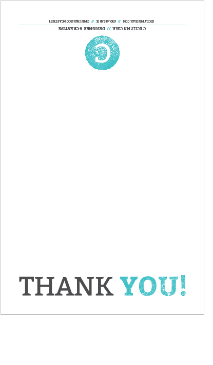
Thank-you card (unfolded) interior. For the thank-yous I switched up the system a little bit and used the textured bar on the side instead of along the top. This was how I initially wanted to use it on everything, but the letter-sized papers seem to work a lot better with it across the top. I like to think of the textured bar as being versatile and movable, and I think this vertical bar will make another appearance in my leave-behind.

Thank-you card (unfolded) interior. For the thank-yous I switched up the system a little bit and used the textured bar on the side instead of along the top. This was how I initially wanted to use it on everything, but the letter-sized papers seem to work a lot better with it across the top. I like to think of the textured bar as being versatile and movable, and I think this vertical bar will make another appearance in my leave-behind.
Subscribe to:
Comments (Atom)