Type of Activity: Senior BFA Thesis Exhibition
Points Available: 200 points
Date: April 12-28, 2013
Location: Anderson Gallery, Fine Arts Center, Drake University
Presenters: Cecily Pincsak, Meanz Chan, Hannah Pink, Aron Johnston
Title: Proximity
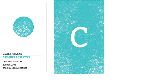
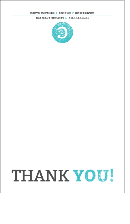
Entry: This exhibition is the culmination of months of preparation by my three classmates and I, and a representation of our current work as senior Art & Design students at Drake. While our pieces are all independently created and in line with our individual areas of interest, the show itself was completely collaborative and would not have been a success without everyone's dedication, work ethic, enthusiasm, and good humor. The four of us were responsible for every aspect of planning and executing the exhibition, from contacting local media outlets to purchasing the food for the reception. We developed an identity system for the show (pictured below) and designed a cohesive set of collateral materials including mailers, posters, wall vinyl, t-shirts, and gallery guides. My group worked very hard to curate a balanced, engaging, and diverse exhibition featuring pieces from across the spectrum of Fine Art and Graphic Design. Along with the content, we put a great deal of consideration (and time!) into the show's physical design and installation, and were meticulous in every aspects of our preparations to host a successful opening reception and two-week run.
Assessment: Our exhibition has not been "officially" assessed at present, although we are in the process of scheduling a review discussion between the four of us and A&D faculty members. I will update this entry with information from this review once it has taken place. My group is keeping an eye on the media outlets we sent press releases to as well, to see if any reviews of the show are published in the near future. If we find any, I will update this entry to include those as well.
Conclusion: This was absolutely one of the most challenging, intimidating, and rewarding experiences of my life. Putting together this collaborative show has helped me grow in ways I could never have anticipated--but, fittingly, one of the biggest surprises for me was realizing the enormous role design played in the process. From the beginning, I was openly skeptical that design would come into play very much during what was clearly an
art show... I love the idea of hybridizing the two, but I didn't see my design pieces working well with my print pieces in any context (and especially not with the drawing and painting pieces of my group members). I assumed that the BFA exhibition was meant to showcase our normally-secondary studio work--after all, why would we be getting a BFA and a studio minor if there was no chance to celebrate or focus on those pieces as well?
Of course, this was not the case. First off, there were the obvious design projects that needed to happen: I was primarily responsible for designing our show's logo and identity system (with input from my groupmates), and developing both the mailer and the gallery guide took far more thought and work than I'd anticipated. Having never designed a functional postcard before, I was in frequent contact with Drake's post office to make sure that our card's layout met all the postal regulations for mailing; any real-world experience is extremely valuable to me, and I am sure this knowledge will come in handy in the future. I worked closely with Christian Printers to produce our mailers and gallery guides, and I felt like I developed a good relationship with them as a client during the several weeks I was in contact with them. We students hear how important it is to build lasting relationships with printers and other service vendors, and I think a project like this was the perfect way to start that process.
Developing the exhibition itself was a feat of careful design! We had to consider proportion, balance, grids, and layout just as thoughtfully in the gallery space as we would have in an InDesign document. We placed our large, "feature" pieces first, and then filled the spaces between them with a deliberate mix of media and subject matter. We did not want any area of the gallery to feel heavy or cramped compared to the others, but we wanted enough range and variation to keep the entire space engaging and visually appealing. It may not have been "graphic design" in the traditional sense, but I feel that we used most of design's basic principles to create a communicative, interesting, and accessible space for everyone to enjoy (whether they are art-educated or not!).
Finally, contrary to my expectations, I feel was able to successfully incorporate some of my strongest design pieces with my studio work. While considering my overall "thesis," I was able to draw connections between the two areas of work beyond the more obvious visual links (i.e. the use of text in my prints). I also developed two "hybrid" pieces that were equal parts graphic design
and printmaking, to further bridge the gap I perceived. I take pride in both my design work and my print pieces, and I am glad I was able to create a balance between the two and showcase a well-rounded body of my recent work at Drake. The exhibition is a strong representation of me as an artist and a designer and I would not change a single thing about it.
Documentation: Here are some process photos and shots of the exhibition. Of course, it really needs to be experienced in person for the full effect!